
Home > Catalogue > Browse > Nocturne: Blue and Silver – Chelsea << >>
Technique

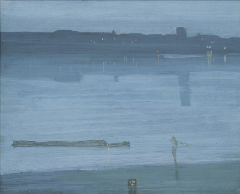
Nocturne: Blue and Silver – Chelsea, Tate Britain
It is painted on a dark grey ground. The brush left long ribbons of thin, creamy paint right across the canvas from side to side, painted smoothly and evenly to give a feeling both of space and of movement, and employing a limited range of cool, luminous colour.
In 1892 Walter Richard Sickert (1860-1942) wrote that the 'the sweep of the brush horizontally across the whole' was 'charming'. 1
Marc Simpson comments, 'the "valuable and true speech" of painting includes the wit of Whistler's brushwork, the horizontal strokes that merge virtuosic handling with literal depiction, the brush-strokes leaving tracks in the paste-like paint to mime the river's rippling currents.' 2 These slightly wavering 'horizontal sweeps of the brush', as Elizabeth Prettejohn observes, 'might be described rather as an allusion to the rippling of the water than as a representation of it.' 3
The details of the barge, the figure and the butterfly were superimposed on the water, in slightly thinner paint (less 'paste-like', and more like watercolour).
A detailed report by Professor Joyce H. Townsend, done at Tate Britain, adds valuable details on the technique, condition and conservation of the painting:
'The support for this painting is a thin, warp-free, hardwood panel, probably mahogany. Such a support gives a very smooth surface, less textured than a fine canvas. It is so thinly painted that the wood grain can be seen when it is viewed from a raking angle.
This panel was thinly primed on the reverse, with light grey oil-based paint including lead white, bone black, vermilion, and an unidentified blue pigment. Whistler may well have applied this, since it is a mixture he often used, and his foresight has contributed to the flatness of the panel, which otherwise would tend to warp concave on the paint-free side.
The front has a more conventional but thin white priming of lead white and oil, applied over a glue size, likely before its sale. Whistler added a thin and fairly dark grey imprimatura to the whole panel, which significantly affects the perceived colour of the blue paints, making them appear cooler by contrast. It is less thinly applied in the area of the foreground shore and probably also for the distant shore, that is, it was used to block them onto the otherwise uniform mid grey imprimatura. Highly diluted with turpentine, this paint ran down the sides of the panel in places.

Nocturne: Blue and Silver – Chelsea, X-ray

Nocturne: Blue and Silver – Chelsea, UV light
A digital X-radiograph of the panel shows the marginally thicker paint used for the sky and water, but otherwise reveals only shadows of the composition. Not even the butterfly signature is rendered clearly. Neither the X-radiograph nor the infrared image suggest any previous use of the panel.
Heating of a paint fragment suggested that natural resin might be included in the paint medium, while its fluorescence in ultraviolet light suggested heat-treated oil. Analysis of the paint medium (at the then Institut Collectie Nederland, Amsterdam, in 2001) indicated linseed oil and a trace of beeswax or paraffin wax in the lightest blue paint of the water.
It is likely that Whistler would have added medium modifier to the paint, as well as large amounts of turpentine to dilute it, to provide physical thinness for the single paint layer, and to prevent it forming drips and runs that would fatally distract from the horizontal brushstrokes. The latter additive makes paint dry matte, while the former counteracts this by restoring the glossy appearance of less-thinned oil tube paint. The very thinness of the paint layer rendered the other ingredients of the medium modifier undetectable by materials analysis: from the analysis of other works, these might have included mastic resin and copal resin, cooked with added drying oil, usually linseed oil, as a commercial megilp. The linseed oil may be evidence for this, since white and light blue paints supplied in tubes were often bound in poppyseed oil rather than linseed, because poppyseed oil was thought to yellow less, and thus not to spoil the appearance of these particularly pale colours. The detected traces of wax were probably not added by Whistler: they were common additives in tube paints by this date, to provide a longer shelf life.

Nocturne: Blue and Silver – Chelsea, Infra red
The horizontal brushstrokes for the water all sweep inwards, and were made with a brush with stiffish hairs. The infrared image illustrates the deeper texture of the brushstroke, and suggests they were swept successively from left to right, then back in the opposite direction, for the water. Most span the whole width of the panel. Raking light reveals that the water, and the sky and its light clouds, were painted up to and just over the darker shores defined by blocking in with the paint of the imprimatura. The lights and reflections were made with a long, soft brush, onto just-dry paint, and many were wiped after brushing. They nonetheless have considerably thicker paint than any other areas.
There were some small paint losses in the right of the sky, a vertical scratch in the centre of the water, and a spot in the lower right foreground where Whistler painted over a knot in the panel. The paint that retouched the losses and the scratch is similar, and all these retouchings are likely his. They had all grown yellow with age by the 1990s, when they were themselves retouched following varnish removal, to prevent them from standing out too obtrusively. 4
Lead white and bone black are found everywhere, with traces of vermilion, madder and a dull red ochre. Synthetic ultramarine, Prussian blue and madder were added to make the imprimatura that forms the cool blue foreground, but there is Prussian blue alone in the paint of the sky. The water includes cobalt blue and a distinct red lake from the madder, this blue giving it a greener tone. 5
The lights on the farther shore were applied with a pale cream paint made from lead white and yellow ochre, with added red lake, possibly that used for the water, a transparent red ochre, and possibly gamboge, a transparent yellow pigment use in oil paints at this time, but previously more used for watercolour painting. Here Whistler may have added turpentine but no megilp-like medium modifier, causing a fine-scale ‘orange-peel’ effect as the paint dried. There is no unmodified tube paint to be seen on this work.
Whistler’s fingerprints can be seen on the short sides, where he handled the panel before he put it aside while the paint dried. They are now filled in lightly with dirt.' 6
Conservation History
Joyce H. Townsend reports further:
'The conservation history is not documented: indeed there may not have been any treatment carried out in the past. The original natural resin-type varnish, with fainter impressions of fingerprints, applied thickly with a brush, may well have been present until the 1990s. By then it was yellowed to such a degree that ‘blue-green’ would have seemed a more suitable title, its brush application making the yellowness very streaky. This varnish was removed by Stephen Hackney at Tate during the 1990s, which enabled the cool blues of water and sky to be seen to advantage, and also made much more sense of the several titles involving the word "silver" given to the painting. The varnish was replaced with a non-yellowing synthetic one, the acrylic resin Paraloid B-71. Since then the painting has not required any further conservation treatment.' 7
Frame
- 1871: Flat Whistler frame with painted seigaiha and butterfly; paint on gold leaf (oil gilding) on wood (oak on pine). [11.4 cm]. 68.5 x 82.5 x 4.5 cm. Frame possibly made by Frederick Fox.

Nocturne: Blue and Silver – Chelsea, Tate Britain

Nocturne: Blue and Silver – Chelsea, frame detail
This is perhaps Whistler’s prototype for the frames he developed throughout the 1870’s. The butterfly signifies Whistler’s intention for the frame to be an extension of the painting. The irregular slip-frame next to the painting is original.
The painted seigaiha pattern of overlapping blue waves was inspired by Japanese prints, but has now discoloured and looks browner, rather than light blue. It corresponds to another pattern under the gilding and it is likely Whistler had the frame redecorated.
The patterns were sometimes painted on the frames by Walter Greaves (1846-1930), who was Whistler’s studio assistant during the early 1870s. During the preparations for the 1871 Dudley Gallery exhibition, Whistler was visiting Speke Hall, the Liverpool home of his patron Fredrick Leyland, and was unable to supervise the hanging of his canvases. While there, Whistler wrote to Greaves:
I am very glad you and Harry [Greaves] have been to the Dudley - and that the two “harmonies” look swell among the crowd – Have they managed to fit in the little gold flat you know that Clay took down to the Gallery and that they wouldn’t let him put in the frame, but fixed it in themselves? Does it look all right? They have not taken off too much of the butterfly have they?' 8
Thus, even when absent from London, Whistler displayed a genuine concern about the framing and presentation of his artwork. It is not known why the flat mentioned by Whistler was required, but this added liner still surrounds the painting today. The innermost gilded edge, which is closest to the painting’s surface, is uneven. The right and left-hand sides are wider than the top and bottom. Perhaps this uneven edge resulted from the Dudley Gallery inserting the flat in such a way that Whistler’s butterfly signature, located at the bottom-centre of the canvas, was not covered up. In the same letter, Whistler mentioned painting at the seaside,
'I hoped to be able to find some grand greys and great masses of waves that I might spread over a couple of small canvasses with the true waterman’s jerk, and send up for you both to hang and put in the patern [sic] when the frames which poor Fox would be unable to make should have come from Foord & Dickinson.' 9
Here, Whistler revealed significant insights into the framing of his early 1870s works. The pattern he mentioned could be interpreted as either the painted seigaiha or basket-weave pattern. Whistler also mentions two frame-makers by name. He implied that Fredrick Fox would have difficulties making these frames for some reason, and that Foord & Dickinson would make them instead. This off-hand remark is Whistler's first mention of Foord & Dickinson. It is possible that the two frames on Variations in Violet and Green and Nocturne: Blue and Silver – Chelsea, both seen at the Dudley Gallery in 1871, were made by Fredrick Fox, but for future frames he proposed to hire Foord & Dickinson.
The art critic Thomas Taylor (1817-1880) mentioned Whistler’s frames and stated:
'The colour, consistently with the theory of the painter, is carried out into the frames by means of delicate diapering and ripplings of faint greens and moony blues on their gold, and the Japanese influence in which the painter delights is carried even to the introduction of the coloured cartouche.' 10
Taylor’s observations of Whistler’s frames are among the earliest made by the press, and his mention of the ‘delicate diapering and rippling’ could describe both the basket-weave and the seigaiha patterns. He went on to comment on the presence of the butterfly signatures on the frames, saying, ‘Mr. Whistler has introduced his own monogram or symbol in this way, carefully attuning the colour of the cartouche to the dominant harmony of his picture.' 11
These comments describe the incorporated butterfly on Nocturne: Blue and Silver – Chelsea more accurately than the haphazard insect floating on Variations in Violet and Green. This further supports the possibility that the butterfly on Variations in Violet and Green was added to the surface after its initial creation. While visitors to the Dudley Gallery in 1871 may have seen both forms of decoration, it is most likely that the seigaiha pattern on Nocturne: Blue and Silver – Chelsea is in an untouched state, and was the subject of Taylor’s comments.
Notes:
1: W. Sickert 1892 [more], at p. 547.
2: Simpson, Marc, 'Whistler, Modernism, and the Creative Afflatus', in Simpson, Marc, Like Breath on Glass: Whistler, Inness, and the Art of Painting Softly, Sterling and Francine Clark Art Institute, Williamstown, MA, 2008, pp. 24-51, at 29-31. See also Robins 2007 [more], pp. 19-20, emphasizing the 'horizontality of the brushwork'.
3: Prettejohn 2007 [more], p. 173.
4: Around the extreme edges at the short sides and the top, numerous small damages caused by framing have been retouched, but probably after Whistler’s lifetime.
5: It is these subtle combinations of different blue pigments that made the painting so difficult to render accurately using late 20th-century colour film: many colour reproductions from that date made the painting look too uniform in tone, and far too reddish a blue, since the film did not register the contribution of the Prussian blue pigment.
6: Joyce H. Townsend, Tate Britain, 2017; Hackney, S., ‘Colour and tone in Whistler’s “nocturnes” and “harmonies” 1871-72’, The Burlington Magazine, 1994, vol. 136, pp. 695-99, at p. 657. Hackney, S., and J. Townsend, 'J. A. M. Whistler: Nocturne in Blue-Green 1871', in Hackney, S., R. Jones, and J. Townsend (eds.), Paint and Purpose: A Study of Technique in British art, Tate Publishing, London, 1999, pp. 152-57.
7: Townsend 2017, ibid.
8: Whistler to W. Greaves, [14 November/December 1871], #11496.
9: Ibid.
10: Anon., [Tom Taylor], 'Dudley Gallery. - Cabinet Pictures in Oil', The Times, London, 14 November 1871, p. 4.
11: Ibid.
Last updated: 8th June 2021 by Margaret