Home > Catalogue > Browse > Nocturne: Blue and Silver – Battersea Reach << >>
Technique
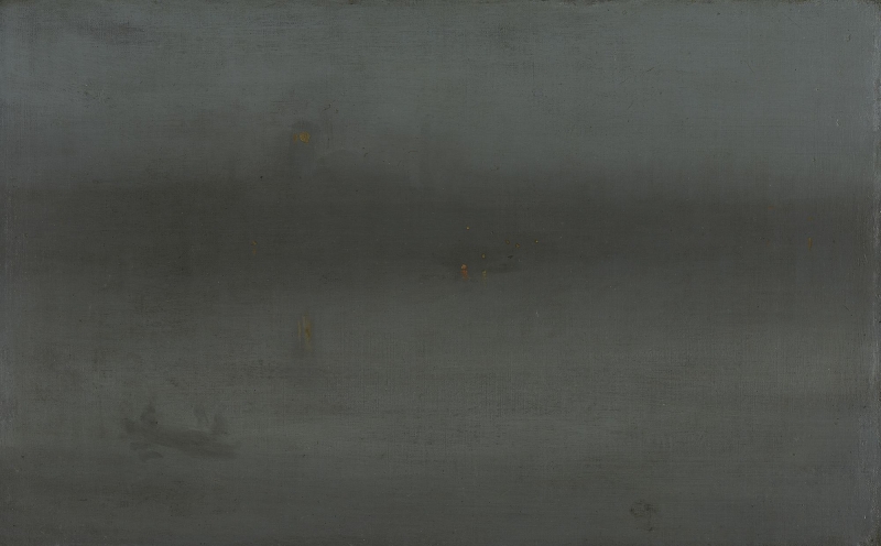
The canvas is fairly fine weave. The paint is very thin, smoothed into carefully graduated tones without sharp lines and edges: only the precisely painted dots of light create points of focus. The Gardner Museum describes the technique as follows:
'He brushed thinned pigment across the canvas in bold, sweeping strokes, modulating the tone of the blue only slightly to create the subtle gradations that separate river, shore, and sky. Specks of orange and yellow mark the position of boats on the water, lights on the shore, and a clock tower in the distance.' 1
Conservation History
The butterfly signature, which has been partly cleaned off, was probably added by Whistler at the time of the 1895 sale (see Harmony in Blue and Silver: Trouville [YMSM 064]).
The present appearance of the nocturne may also have changed. The colour in Nocturne in Blue and Silver [YMSM 151] and Nocturne: Blue and Silver - Battersea Reach [YMSM 152] is similar, but Nocturne: Blue and Silver - Battersea Reach [YMSM 152] is less effective, since the streaks of reflections are painted rather crudely and the figures in the boat, very loosely.
Frame
- 1870s: the style and whereabouts of the original frame are unknown.
- 1892: it was framed for the Goupil exhibition by Frederick Henry Grau (1859-1892), but the painting was returned afterwards to its pre-Goupil frame.
- ca 1894: Grau-style, possibly American: it could have been made by an American framer hired by E. G. Kennedy, following Grau’s pattern. Size 76.2 x 99.06 cm (30 x 39").
Last updated: 25th November 2020 by Margaret


