Technique
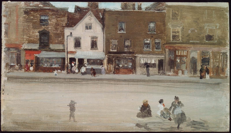
It was painted in an almost calligraphic style, with a very small brush and with a minute attention to detail – comparable to Whistler's work in etching.
The Boston website describes the painting:
'Whistler used many shades of gray and brown, punctuated by reds, to render this London street scene, making Maunder’s fish market, with its facing gable and light color, a focal point. As in most of his images of building facades, he placed the shops fronts parallel to the picture plane. He painted the foreground thinly with smooth strokes, and he used tiny brushes to render an incredible amount of architectural detail in the upper half of the panel and to depict the figures in the foreground and on the sidewalk in front of the stores.' 1
Conservation History
The edges of the painting are abraded, either from the frame or Whistler's paint-box.
Frame
1884: the style and whereabouts of the original frame are unknown.
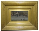
Grau-style frame dating from ca 1904. The profile is rather large for the picture, but the construction is similar to a Grau frame; it may have been taken from another work when the painting was sold, or after Whistler's death. 2
Last updated: 7th June 2021 by Margaret


