Composition
Crepuscule in Flesh Colour and Green: Valparaiso was painted over at least one figure composition, as explained by Professor Joyce H. Townsend:
'the recent digital X-radiograph is not easy to interpret, but there is a suggestion of an underlying image with large figures. Viewed in the same orientation as Crepuscule in Flesh Colour and Green: Valparaiso, there could be two full-length draped figures, one on either side of the vertical cross-bar, probably both extending from the lower edge at least three-quarters the height of the canvas, or else with the one on the right either leaning or seated. Even more debatably, there could be a draped figure placed beneath the cross-bar, not filling the full canvas height and therefore placed further back in the composition. There might be a suggestion of rounded objects in the foreground. The whole impression is fuzzy and this use might have been only a light sketch – or else the early painting was pretty thoroughly removed by cleaning with turpentine.
The infrared photograph, and the view in raking light from the left, also suggest two tall figures in an underlying image, but not the possible middle figure.
Much the same interpretation could be hazarded with the underlying image or light sketch done with the canvas rotated upside-down: in that case, the placement at different heights from the lower edge would suggest figures arranged within a space, set back to varying degrees.
If the canvas was indeed re-used, the first image might have been applied to the white pre-primed canvas. The white lower imprimatura would then have effaced it further, before Whistler applied the [pale pink] flesh-coloured imprimatura in order to paint Crepuscule in Flesh Colour and Green: Valparaiso. That would account for the difficulty in imaging the earlier version.' 1
Technique
According to Arthur Jerome Eddy (1859-1920), it was completed by Whistler 'at a single sitting, having prepared his colors in advance of the chosen hour.' 2 This, though impressive, is simply not true.
A report by Professor Townsend gives full details of recent examination of the painting:
'The "flesh colour" of the title refers to the artist’s pale flesh-coloured imprimatura, applied in two layers over a typical commercial double white priming made from lead white, chalk and oil, on canvas, its upper layer being more opaque. The lower layer of imprimatura contains only lead white and chalk in oil, conferring useful absorbency that enables the "dried" colour of the paint to reveal itself rapidly – which is good for sketching rather than detailed work. The upper flesh colour of the imprimatura includes traces of zinc white as well as lead white, possibly supplied ready-mixed in a tube, not from Whistler’s usual later London suppliers of pure lead white. The flesh colour is made from vermilion, red lake, synthetic ultramarine, bone black and raw sienna or umber, all in small quantities. ...
The composition seen today was developed largely in greatly-thinned paint, the horizon line and main clouds having been established first, without covering the whole surface with paint. Only the ship on the left was drawn in pencil, then painted to follow the drawing. Several of the hulls for ships were sketched in graphite pencil onto the dried imprimatura, while far more vertical lines were dashed in with light pencil strokes to suggest the masts of a multitude more than there are painted hulls now. Only a minority of these sketched lines became the masts of painted ships. Three of the four largest ships, including the one seen astern right of centre and nearest to the viewer, were not drawn in at all; they were painted onto not-yet-covered patches of imprimatura after numerous horizontal lines in graphite pencil had been applied rapidly to indicate their position by means of the outline of sails and cross-beams. Hull and sails were then painted together, using a small brush and single strokes of much-thinned paint. The red flag of this, the nearest ship, was added last.
For more distant ships, the paint was lightly applied as well as thinned, and the last application was a vertical brushstroke for the mast, that began on the deck and headed upwards, the brush almost wiping paint away rather than applying it. The clouds, once finished in more detail, thus overlie many potential masts. The sky was painted up to the shipping and water, with the last applications of paint.
The paint for the water and sky is quite thick by Whistler’s later standards, capable of concealing earlier brushstrokes, and it has retained the drag of the brush hairs as it dried. The masts were clearly painted with thinned paint, applied forcefully so that it has tended to form cracks along the brushstrokes. There are some drying defects that suggest Whistler had problems with his thinner (usually turpentine) evaporating too fast to form a continuous paint film – the unaccustomed temperature of Chile might have been the cause. The paint medium turns yellow on moderate heating, which suggests a medium modifier may have been used as well as a thinner. The fine pattern of cracks running perpendicular to the direction of the brushstrokes suggests this too.
The sky, clouds and water all consist of mixtures of pigments in lead white, including vermilion, red ochre, madder, mars yellow, synthetic ultramarine for the bluer sky, and cobalt and Prussian blues in the greener water, with bone black. Two red flags may be painted with an unusual type of madder lake, judging from their fluorescence in ultraviolet light. There is no evidence for colour loss.
The work is signed "Whistler" and inscribed "Valparaiso. 66", both being painted with separated letters at the lower left, and both sloping upwards to right.' 3
Conservation History

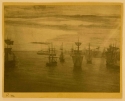
Crepuscule in Flesh Colour and Green: Valparaiso, photograph, ca 1881, Baltimore Museum of Fine Arts
In 1867 the art critic Philip Gilbert Hamerton (1834-1894) commented that it had 'deteriorated considerably since we first saw it.' 4
This Whistler furiously denied in a note dated (possibly misleadingly) November 1878, written under this press-cutting :
'Utterly and stupidly false! the picture is perfect - unaltered in condition and lovely - I saw it the other day in Mr. Howells possession! … My paintings never alter for the reason that they are painted quite simply -' 5
Professor Townsend's report on the painting, already quoted above, adds:
'A strip on the right side was more thinly varnished in the past, or else more thoroughly cleaned during varnish removal. The canvas has been trimmed, likely when it was lined with glue paste, without unduly impregnating the canvas with glue as has occurred in other cases, and it was given a new stretcher, at an unknown date prior to 1963.
In 1963 some yellow varnish, presumably of natural resin type and possibly the original varnish, was removed. A synthetic resin varnish consisting of cyclohexanone was applied at that time, and damages were retouched using the acrylic resin Paraloid B-67, presumably in the sea and sky where they are now visible on close examination. Traces of an earlier yellowed natural resin-type varnish remain beneath this, in particular in the cloud to right of centre. Together, these varnishes confer a moderately yellowed appearance.' 6
Frame
1866: the style and whereabouts of the first frame are unknown.
1879: Whistler asked Charles Augustus Howell (1840?-1890) to get 'the Valparaiso' framed by Foord and Dickinson for exhibition at the Grosvenor Gallery. 7 This frame would have been decorated with a painted seigaiha (blue sea wave) pattern similar to that seen on Nocturne: Blue and Gold - Old Battersea Bridge [YMSM 140].
1890: in November 1890 Whistler asked Graham Robertson, who had just bought the painting, to send it to Frederick Henry Grau (1859-1892):
'Do take this occasion, and send for Grau - and tell him to make you at once one of my beautiful new frames for the Valparaiso - Of exactly the same gold as that he has used for me lately - The old frame is altogether to rickety - & moreover it neither fitted (too large - Grau should have the "sight" at least an [eighth] of an inch smaller all round) nor was it of the right colour - Your picture in the new frame will look five times as stately and beautiful.' 8
Furthermore, he urged another patron, William Cleverly Alexander (1840-1916) to have a similar frame made:
'I want you so much to see The "Valparaiso" at Mr Graham Robertson's - 23. Rutland Gate. ...What I want is that you should see the beautiful effect of my new frame - and then let my man - Mr Grau. 570. Fulham Road make one for your Nocturne - It will gain three times in stateliness and charm.' 9
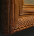
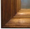
1891: The painted Foord & Dickinson frame of 1878 was replaced by the present one, a Grau Whistler frame: [FD] 36 x 42 ½" (91.4 x 107.9 cm), [MW] 6 ½" (16.5 cm). On the back of the frame Whistler’s framemaker has pencilled ‘F. H. Grau, London, 1891’. 10
Notes:
1: Joyce H. Townsend, technical and conservation report, Tate, April 2018.
3: Joyce H. Townsend, technical and conservation report, Tate, April 2018. See also Hackney, Stephen, ‘Colour and tone in Whistler’s “nocturnes” and “harmonies” 1871-72’, The Burlington Magazine, 1994, vol. 136, pp. 695-99. Hackney, Stephen, and Joyce Townsend, 'J. A. M. Whistler: Cremorne Lights 1872', in Hackney, Stephen, R. Jones, and Joyce Townsend (eds), Paint and Purpose: A Study of Technique in British art, Tate Publishing, London, 1999, pp. 86-89.
4: Hamerton 1867 [more] , at p. 691.
5: Note in GUL Whistler PC, p. 3. Whistler probably did not make this response in 1867. He wrote it alongside the original 1867 press cutting in an album, possibly in 1878 (he dated it 'Nov. 1878', but may in fact have written it later.
6: Joyce H. Townsend, technical and conservation report, Tate, April 2018.
7: [20/27 April 1879], GUW #02840, and [May 1879], GUW #02822.
8: 26 November [1890], GUW #09403.
9: [14 February 1892], GUW #07575; also Whistler to R. A. Alexander, [15/28 February 1892], GUW #07580.
10: Dr Sarah L. Parkerson Day, Report on frames, 2017; see also Parkerson 2007 [more] .
Last updated: 22nd May 2021 by Margaret


