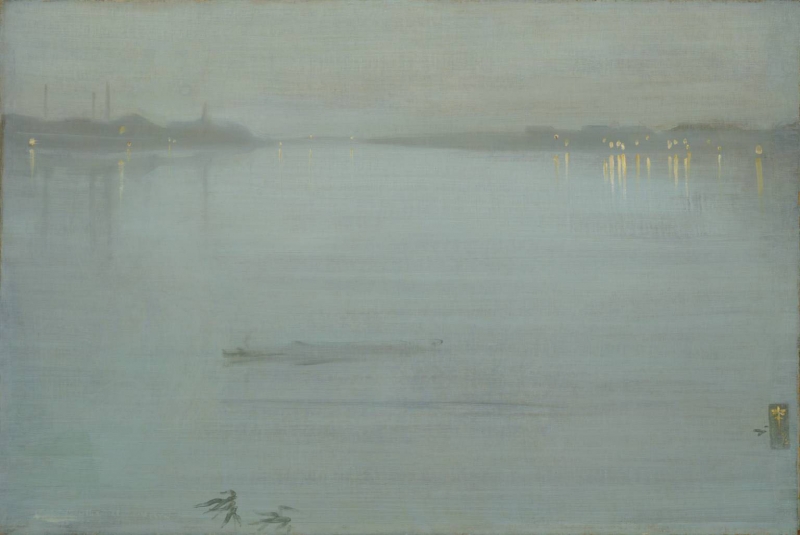
Detail from The Canal, Amsterdam, 1889, James McNeill Whistler, The Hunterian, University of Glasgow

Home  > Catalogue > People > Gerald Potter (related works) > Catalogue entry

Nocturne: Blue and Silver – Cremorne Lights

Composition


                    Symphony in Blue and Pink, Freer Gallery of Art
Symphony in Blue and Pink, Freer Gallery of Art

Traces of a figure subject, similar in style to the so-called 'Six Projects' (Symphony in Green and Violet [YMSM 083], Variations in Blue and Green [YMSM 084], Symphony in White and Red [YMSM 085] etc.), can be seen, very faintly, below the surface of the nocturne. 1


                    Nocturne: Blue and Silver – Cremorne Lights, X-ray
Nocturne: Blue and Silver – Cremorne Lights, X-ray

A recent thorough examination of the canvas was undertaken by Professor Joyce H. Townsend, Tate Britain, and her report follows:

'The original priming, applied only to the picture plane, was off-white and gave the canvas a reasonably smooth texture. Whistler’s first composition included a woman on the left of the canvas in a Japanese-inspired robe, bending at the knees or kneeling and trailing a fan, looking to the right. A second figure nearer to the centre of the canvas is less distinct: likely it is a woman in a similar robe, kneeling and facing to the left. A few brushstrokes can be discerned on the right, but no more figures. X-radiography does not suggest that a great deal of this image has survived, though there was probably some paint wiped away at lower right.


                    Nocturne: Blue and Silver – Cremorne Lights, photograph, 1950s?
Nocturne: Blue and Silver – Cremorne Lights, photograph, 1950s?

In a photograph possibly dating from the 1950s, reproduced above, the shadowy figure to the left is just visible, and in 1993 Tate photographers emulated that image using technical panchromatic film, which was the type used in the earlier twentieth century and most likely for that photograph. 2

The earlier composition had a thin brown imprimatura that survives as brown speckles in the valleys of the rubbed-down surface, without negating the optical contribution of the original off-white priming. It extends to the present right edge.' 3

Technique


                    Nocturne: Blue and Silver - Cremorne Lights, Tate Britain
Nocturne: Blue and Silver - Cremorne Lights, Tate Britain

Whistler did not apply an imprimatura for the nocturne. Once the figure composition had been rubbed down, the main elements in the new composition were sketched in. The river was painted with long flowing brushstrokes reaching right across the canvas. Pentimenti are visible around the raft/lighter/barge near the shore.

Professor Townsend's technical survey of the painting continues:

'Whistler had the canvas enlarged at the right side, by incorporating some 2 centimetres of canvas that had been wrapped round the stretcher edge into the picture plane, onto an added strip of wood, and having the canvas lined with glue paste to another canvas. This was done before painting the first composition on the brown imprimatura, which extends over the enlarged strip. Lining typically makes the canvas weave more prominent than it is in an unlined canvas: clearly Whistler did not object to this underlying texture, for an image that is unusually dependent on the texture created by near-parallel lines of paint.

This later composition involved applying a thin and broadly horizontal wash of dark paint (probably black and raw umber) to form the shoreline, the buildings and the boat. Effectively, it is a local underpainting. Then a `sauce' made of diluted oil paint was brushed in long wide sweeps right across the painting. This paint is a very pale blue made up of synthetic ultramarine, Prussian blue, madder and another red lake, but mostly lead white. It was brushed with a stiff and flat hogshair brush about 2 centimetres wide, the bristles of which have left wide furrows in the paint. There is very little rubbing-down of the paint compared to other canvases, but in places this can be seen with a microscope. Such dilute paint could readily be wiped off, rendering this favourite method unnecessary here.

The brush was fairly evenly loaded and the paint was applied confidently yet sparingly from left to right in horizontal sweeps, with deviations around the buildings, and only occasionally a slight hesitation. The dark outer edges of the shoreline and the boat were covered very thinly with blue paint, utilising the turbid medium effect to create soft outlines to them. Features such as chimneys were quickly worked into the wet paint by removing some `sauce' with a sharp edge, while other features were made by scraping with the brush handle.

The lights on the shore were applied with a round brush loaded with lead white and cadmium yellow with some added vermilion, possibly used straight from the paint tube but already roughly mixed on the palette, applied so as to give narrow streaks of these colours. Compared to the fluid blue paint, these areas stand out thickly. They were applied once and then left alone, not reworked. The effect of ripples in the water was achieved by painting the reflection line wet-in-wet vertically over the horizontal brushstrokes for the blue water, then dragging blue paint back across it. Whistler used the turbidity of the pale blue paint applied over a vestigial brown imprimatura to cool and soften the image, directly emulating atmospheric perspective.

With the exception of the lights on the shore, the paint is highly thinned with turpentine, and this would tend to make it dry matte in a manner inappropriate to the depiction of water, and to form drips and runs too. The addition of either an oil or a resin-based medium modifier, likely involving a mastic-type resin, would counteract the matteness. All the evidence points to the use of the latter over the former addition: the appearance of the paint in ultraviolet light, the way it softens on heating, and its high refractive index. The last property contributes to its transparent appearance, which reveals the earlier image, while also contributing to the ethereal quality Whistler sought for a nocturne. These modifiers also counteracted the tendency of the paint to run and flow. While working with the canvas flat would have achieved the same thing, it might have been possible with medium modifiers to work on an easel as the artist did for portraits, and to retreat from the canvas to observe it at normal viewing distance, which was a frequent habit noted by sitters.


                    Nocturne: Blue and Silver – Cremorne Lights, detail
Nocturne: Blue and Silver – Cremorne Lights, detail

The butterfly signature fully occupies the enlarged strip at the right edge, and was applied to dried paint, using a narrow brush and slightly thinned tube paint. It consists of two crossing horizontal strokes of paint, a shorter one beneath, and a final vertical brushstroke. It would have been painted rapidly and with assurance, just like the reflected lights in the water. It is covered with a protective brushstroke of varnish that might not be original.' 4

Conservation History

It was probably among paintings sent to Stephen Richards (1844-1900) to be cleaned, varnished and have the frames gilded, apparently without the owner's consent. D. C. Thomson of Goupil's told Whistler, 'Even although he admits they are improved he maintains very warmly that it was what he calls a disreputable thing for Goupil to do anything without his consent. He refuses to condone what he calls our offence. But all the same we hope to get round him.' 5 J. C. Potter wrote confirming both his objection and his approval: 'I must say, that on seeing the pictures, they appear to me immensely improved by the cleaning. If you are equally satisfied with the execution of the work by Mr Richards, so shall I be.' 6

Professor Townsend comments:

'Whistler’s extension of the canvas had long preceded the cleaning and varnishing by Richard Stephens [in 1892], authorised by the Goupil Gallery but not by the then owner. Lining has not affected the condition or appearance of the painting as much as earlier linings tended to do. The edges have more recently been strip-lined to strengthen them, and at some point the lined-in right edge required retouching, but these treatments are not documented. This may suggest a date during the Second World War, and prior to the formation of the Tate Conservation Department in 1955. By 1993 the non-original varnish(es) were extremely yellow and also uneven, having been applied horizontally with a broad brush some 12-15 centimetres wide. They were removed at Tate by Stephen Hackney, along with old retouchings, and a new varnish of non-yellowing synthetic resin was applied. The painting has not required any treatment since then.' 7

Frame

1873: The frame was originally decorated with a fish-scale pattern. Whistler described his aims to George Aloysius Lucas (1824-1909):

'my frames I have designed as carefully as my pictures - and thus they form as important a part as any of the rest of the work - carrying on the particular harmony throughout - This is of course entirely original with me and has never been done - Though many have painted on their frames but never with real purpose - or knowledge … This I have so thoroughly established here that no one would dare to put any colour whatever ... on their frames without feeling that they would at once be pointed out as forgers or imitators; and I wish this to be also clearly stated in Paris that I am the inventor of all this kind of decoration in color in the frames; that I may not have a lot of clever little Frenchmen trespassing on my ground -

You will see my mark on pictures and frames - It is a butterfly and does as a monogram for J.W. Characteristic I dare say you will say in more ways than one!' 8

This painting’s first frame, now lost, had a painted pattern, which may have followed that seen on Tate’s Nocturne: Blue and Silver - Chelsea [YMSM 103], painted in 1871.

1892: Whistler suggested that the painting’s owner, Gerald Potter (1829-1908), should get all his works reframed by Frederick Henry Grau (1859-1892), and this may have been done before the Goupil Gallery exhibition of 1892. However, Potter refused to pay the cost of reframing and may well have retained Whistler’s first frame to avoid the expense of a replacement that he had not requested. 9


                    Nocturne: Blue and Silver – Cremorne Lights, framed
Nocturne: Blue and Silver – Cremorne Lights, framed

                    Nocturne: Blue and Silver – Cremorne Lights, frame detail
Nocturne: Blue and Silver – Cremorne Lights, frame detail

After 1903, modified ca 1919: The present frame is a replica of a Grau-style frame, possibly the painting’s third frame: gold leaf (oil gilding) on wood (pine).

This Grau-style frame may have been a replica made after the painting was acquired by Arthur Haythorne Studd (1863-1919), possibly made after Whistler’s death in 1903, and prior to Studd's bequest of the work to Tate in 1919.

Notes:

1: Stephen Hackney examined the painting and established the form of this underlying figure composition. Hackney 1995 [more] .

2: Today, a camera sensitive to the short-wave infrared as well as to visible light, with sensitivity adjustable within this range by using filters, might give more information on the underlying image than did an infrared image taken with a modified conventional camera (not reproduced); the infrared image suggested that there were more dark or black pigments used on the right side than on the left. A transmitted light image (also not illustrated here) did not give any new information.

3: Dr (now Professor) J. H. Townsend, November 2017; see also Hackney, S., ‘Colour and tone in whistler’s “nocturnes” and “harmonies” 1871-72’, The Burlington Magazine, 1994, vol. 136, pp. 695-99; and Hackney, S. and J. H. Townsend, 'Nocturne in Blue and Silver: Cremorne Lights 1872', in Hackney, S., R. Jones and J. Townsend (eds.), Paint and Purpose: A Study of Technique in British art, Tate Publishing, London, 1999, pp. 86-89.

4: Townsend 2017, op. cit.; Hackney 1994, op. cit.; Hackney and Townsend 1999, op. cit.

5: Thomson to Whistler, 2 April 1892, GUW #05713.

6: J. C. Potter to Whistler, 4 April 1892, GUW #05006.

7: Townsend 2017, op. cit.

8: [18 January 1873], GUW #09182.

9: Whistler to Potter, [26/30 March 1892], and [January/February 1894], GUW #01488 and #13346.

Last updated: 22nd November 2020 by Margaret